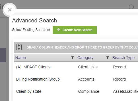
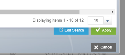
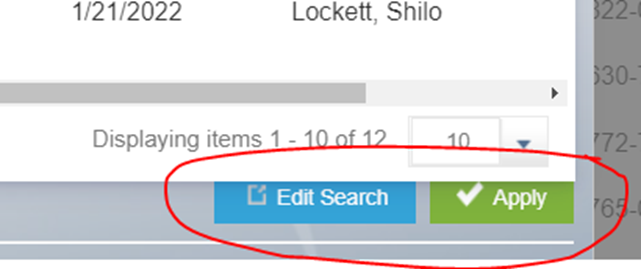
Fix Advanced Search 'Edit' and 'Apply' buttons
We recently moved from desktop to Cloud and have been learning how to navigate the new system. One of the things that continues to trip folks up is the way the "Edit Search" and "Apply" buttons display in the Advanced Search tool. The buttons themselves appear as if behind and overlapped by the dialogue box in which you are working - giving the illusion that they are used for the screen behind the window, and not the advanced search tool. It would be great if this was corrected so the tool is more intuitive for users.
For comparison, the 'Create New Search' button shows up clearly within the upper left of the window, while the aforementioned buttons appear toward the lower left outside of and slightly behind the window. (See print screens below)
Topic Participants
Shilo Lockett
CRM Product Management